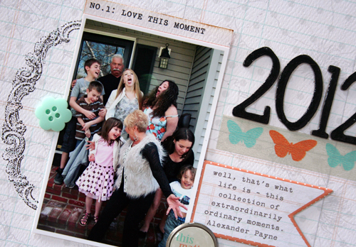
Ever heard the saying that change is good? When it comes to all things creative, I would have to agree. Change and exploration keep our scrapbooking fresh and fun! I recently changed up the size of the pages I worked on and was really pleased with the process and results.
I am typically a 12X12 scrapper. I love white space and multiple photos. But, I decided to try out 8.5 X 11. I won't lie...it seems small. I think there are ways to make the shift easier. First, I started out with a smaller photo, sized around 3.5 X 2.5. That allows some white space. Next, I grabbed some of my favorite embellishments from Teresa's new collection, Tell Your Story. The right placement and layering of elements make the smaller size fun to work with.
Even though I worked with a smaller size paper, I think some bold elements are needed to add pop. The handcut banners from the paper named Pennants. Because these were placed on the top, I used a dark title and placed my photo close to the bottom.
To anchor the photo, I used one of the the Tell Your Story stamps and put the photo to the right. I layered a library card cut from the Cards paper and clustered the brad and chipboard piece. My title was floating in the air so I used a piece of the washi tape underneath.
Why not grab some of your favorite Teresa products and try something new today!


Stacey i'm loving the stamp behind the photo and what a fun photo! Great way to journal also.
ReplyDeleteSo Cute Stacey! I love how you cut out the banners!
ReplyDeleteMy new favorite colors, great job!
ReplyDelete